For the last decade, graphic design was a game of manual labor. You pushed pixels, nudged vectors, and spent hours hunting for the perfect stock asset. That era is rapidly flatlining.
The combination of Nano Banana Pro and Gemini 3 suggests a shift in the creative baseline. We aren’t just looking at faster tools; we are looking at a fundamental collapse of the barrier between “idea” and “asset.” This isn’t about replacing the designer. It’s about equipping them with a nuclear reactor.
Here is why the latest update puts you into what industry insiders are calling God Mode.
1. Perfect Text Rendering: The Typography Singularity
The days of AI-generated gibberish are over. Nano Banana Pro has cracked the code on dense, coherent text integration. We aren’t just talking about a legible headline; we are seeing complex menus, detailed nutritional labels, and intricate storyboards rendered with near-perfect spelling.
But the real utility lies in stylistic typography. You can now generate fonts composed entirely of the subject matter—letters made of melting cheese, zesty orange peels, or isometric piping. This allows for bespoke branding assets that would typically require days of 3D modeling, generated in seconds.
2. Multi-Reference Synthesis
Creativity is rarely about invention; it’s about synthesis. Nano Banana Pro now supports up to 14 simultaneous reference images. This is a massive leap in control.
You can feed the engine:
- A specific color palette.
- A rough sketch or layout.
- A stylistic reference (e.g., “Riso print” or “GTA map style”).
- A subject (e.g., your own headshot).
The model understands spatial context. If you ask for a website mockup using a specific logo on a laptop screen in a cafe, it understands the geometry, lighting, and perspective required to mesh those elements seamlessly.
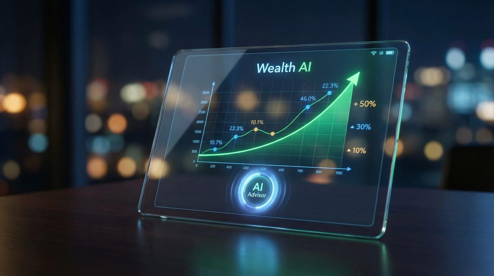
3. Truth-Grounded Design via Gemini 3
This is where the utility spikes. Most AI design tools hallucinate data. By pairing the visual engine with Gemini 3’s knowledge base, you can generate factually accurate infographics.
If you request a financial breakdown of a specific stock for 2025, the system researches the data and populates the design with real numbers. Is it perfect? Not always. But the ability to ask the AI to “self-reference” and error-check its own output drastically reduces the hallucination rate. We are approaching the death of “Lorem Ipsum.”
4. 4K Resolution & Extreme Consistency
Low-res exports are useless for production. The new standard is 4K export, allowing for crisp, client-ready assets.
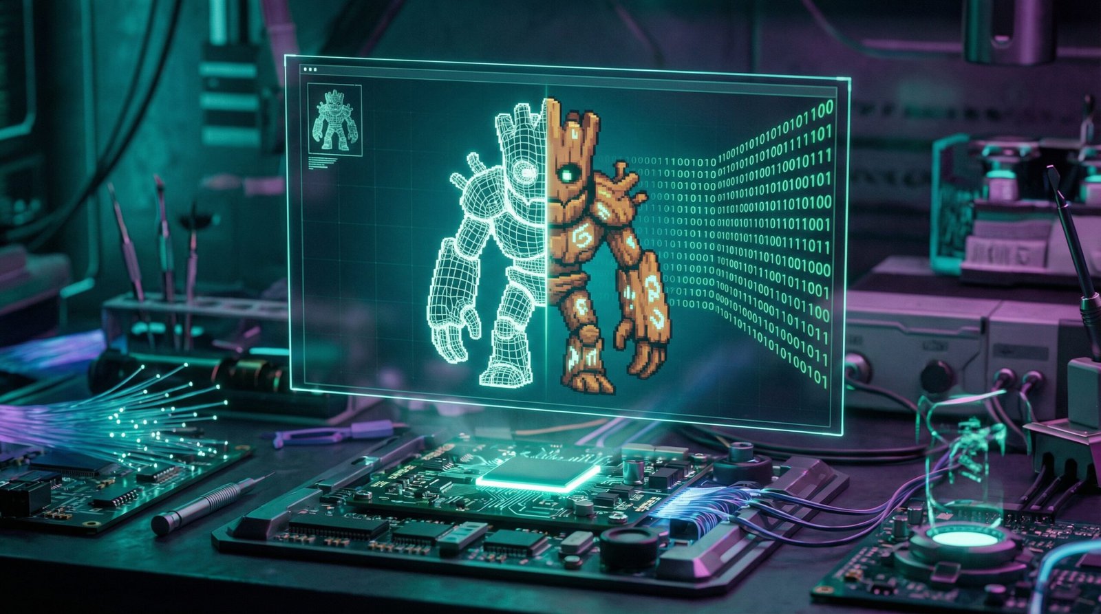
More impressively, character consistency—the Achilles’ heel of generative AI—appears to be solved. You can place a specific model (down to the curl of their hair and texture of their coat) into five different environments, from a subway train to a windy street, without the face morphing into a different person. For narrative storytelling and brand campaigns, this consistency is non-negotiable.
5. The “Layered” Reality
The tool doesn’t just flatten everything into a single JPEG. With features like Touch Edit, you can select specific elements—a search bar, a headline, a background light—and modify them independently.
Coupled with tools like Lovart, which acts as a “Design Agent,” you can execute entire branding suites—logos, merchandise, web mockups—in a single, unified workflow. The agent breaks down the brief, plans the assets, and executes them with a cohesive visual identity.
The friction is gone. The only limit left is your taste.